
The Subtle Texture That Defines 1968 Topps
Some baseball card sets smack you in the face visually the moment you see them. Bright colors, loud graphics, something bold that grabs your attention immediately.
The 1968 Topps set works a little differently.
At first glance it feels almost understated. The layout is simple. The portrait photography is straightforward. The player’s name runs cleanly along the bottom of the card while a small colored circle in the lower corner identifies the team and position.
But spend a little time with the cards and something starts to stand out.
The background.
Behind the player portrait, Topps used a subtle speckled pattern that gives the card a textured look. It almost feels like a linen surface printed into the design. It’s not a detail that jumps out right away, but once you notice it, you start to see it everywhere throughout the set.
And it changes how the cards feel.
That soft textured background adds depth to what is otherwise a very clean and balanced layout. It gives the portrait photography a little more presence without overwhelming the design. It’s a quiet design choice, but it’s one of the things that has helped make the 1968 Topps set such an enduring favorite among collectors.
The set also includes some major rookie cards that anchor it historically. Most notably the debut of Hall of Fame catcher Johnny Bench, along with the famous dual rookie card pairing Nolan Ryan and Jerry Koosman.


Those cards alone make the set memorable, but the design itself is what keeps collectors coming back to it.
One of the interesting things about the 1968 set is that it sits right at the tail end of Topps’ classic 1960s design era. The louder, more experimental designs of the 1970s were just around the corner, but this set still carries a certain quiet confidence. It doesn’t try too hard. It simply works.
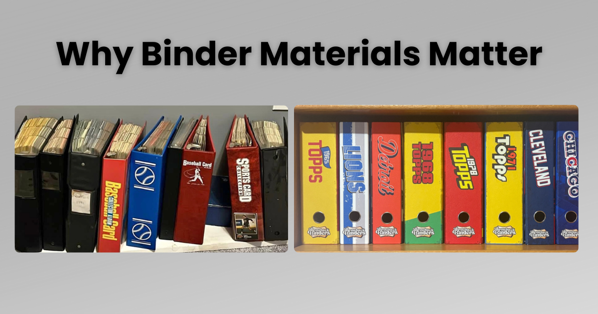
That subtle texture is also one of the reasons the set pairs so naturally with the Throwback binder designed for it.
Instead of vinyl or plastic, the binder cover is wrapped in linen over rigid chipboard. The material has a natural texture that echoes the linen-like pattern printed into the background of the cards themselves. It’s a small design connection, but it feels right when the two are seen together.

Sometimes the best design details are the ones you notice only after spending a little time with them.
The 1968 Topps set is a perfect example of that idea. It may not be the loudest design of the era, but for collectors who appreciate the details, it’s one of the most distinctive.
And once you see that texture, you really can’t unsee it.
READ OTHER RELATED ARTICLES


Be first to hear about new binder drops.
We’ve got more teams and sets coming. Don’t miss out on the next release.